PSTAT 100: Lecture 03
Statistical Visalizations, Part I
Descriptive Statistics
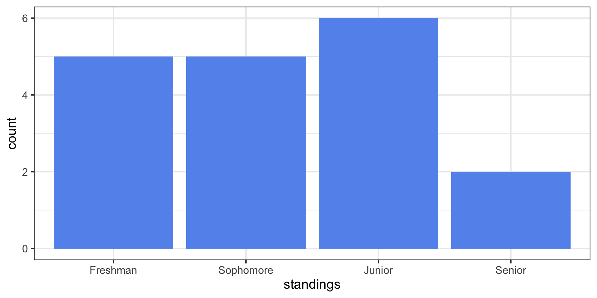
standings Dataset
Descriptive Statistics
Barplots/Bargraphs
This type of plot is called a barplot (or bargraph), and is the ideal visualization for a categorical variable.
In general, for a categorical variable with k categories C1 through Ck with corresponding frequencies f1 through fk, the resulting barplot will have k bars with the height of the ith bar given by fi.

Pie Charts: RIP
- Perhaps you’ve heard of (or seen) pie charts
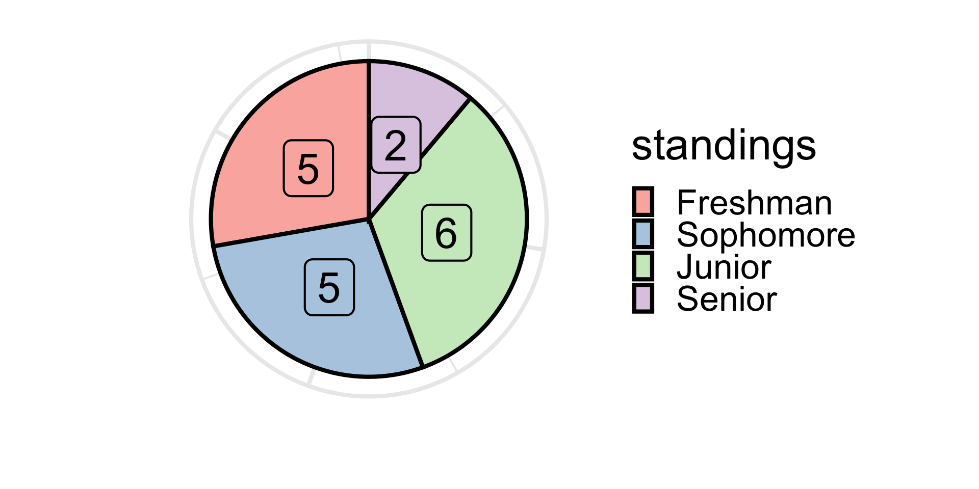
- Pie charts are practically never used within the statistical commmunity anymore.
- Basically, areas of circular sectors can be misleading.
Stick with a barplot!
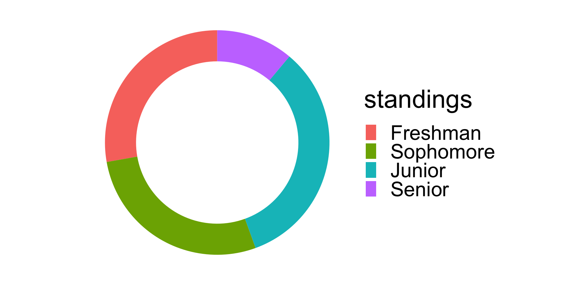
If you really desire a desert-themed plot, consider a donut plot:
Descriptive Statistics
Numerical Variable
- We can, however, “inject” categories into our data.
- That is; though we do not expect to have two or more students with exactly the same score, it is plausible to have a great many students with scores within some specified range
- To start, let’s consider ranges of scores that are 5 points in width:

Descriptive Statistics
Numerical Variable

- The resulting plot is called a histogram.
Descriptive Statistics
Binwidths

Descriptive Statistics
Binwidths

Descriptive Statistics
Binwidths

- Notice the effect that changing the binwidth has on the overall shape of the histogram!
- When creating your own histograms, pay attention to your binwidth.
- In practice, there isn’t a single ideal binwidth that should be used; instead, play around with a few different binwidths before settling on one you feel results in a histogram that best captures the distribution of your data.
Descriptive Statistics
Boxplots

Descriptive Statistics
Boxplots and Histograms
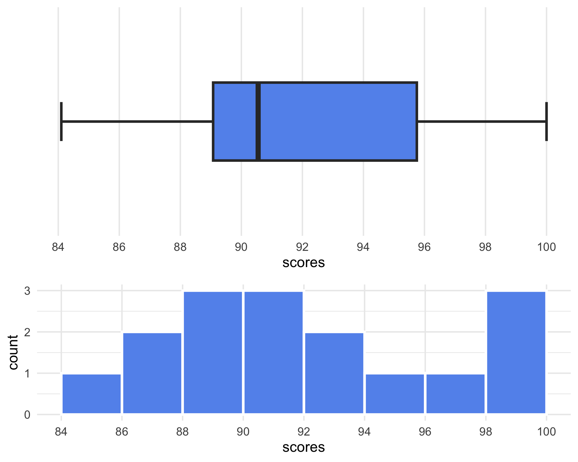
- Note that both plots indicate a sort of “skew” to the data that is pulling the average of scores to the left.
- The skew is, however, not strong enough to introduce outliers into the dataset (how do we know that?)
Descriptive Statistics
Example: Boxplots
Example: 100 people were asked to run one mile; their completion times (in minutes) were recorded, and the following boxplot was generated:
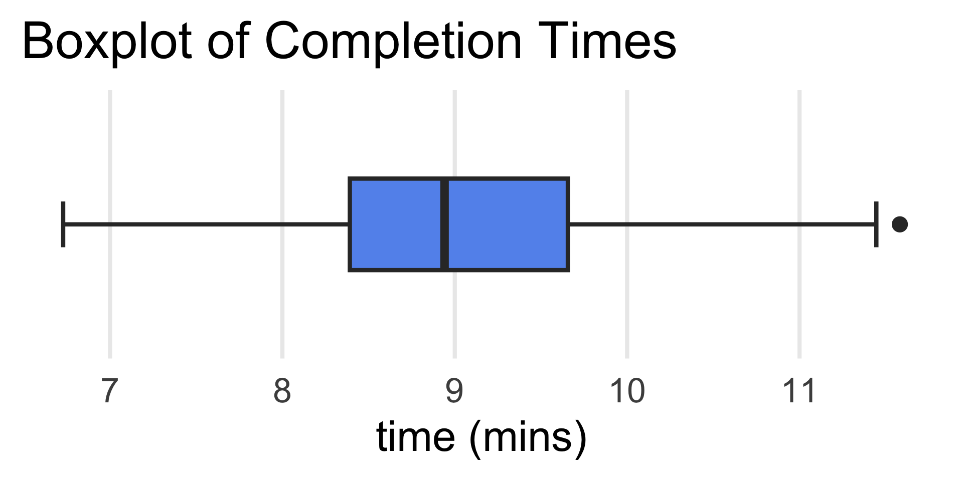
- What were the slowest and fastest completion times?
- What was the median completion time?
- Anna ran a mile in around 8.5 minutes. Aproximately what percentage of runners were faster than her?
Scatterplot
- Such a plot is called a scatterplot.

Scatterplot
Trends

Scatterplot
Trends

- Another way to describe the findings of a scatterplot is in terms of the association between the variables being compared.
- For instance, if the scatterplot of
yvs.xdisplays a positive linear trend, we would say thatxandyhave a positive linear association, or thatxandyare positively linearly associated.
- For instance, if the scatterplot of
A Numerical and a Categorical Variable
Dotplot
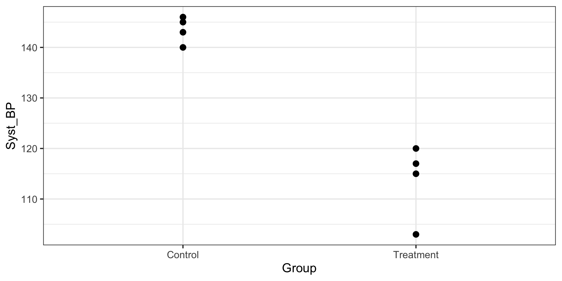
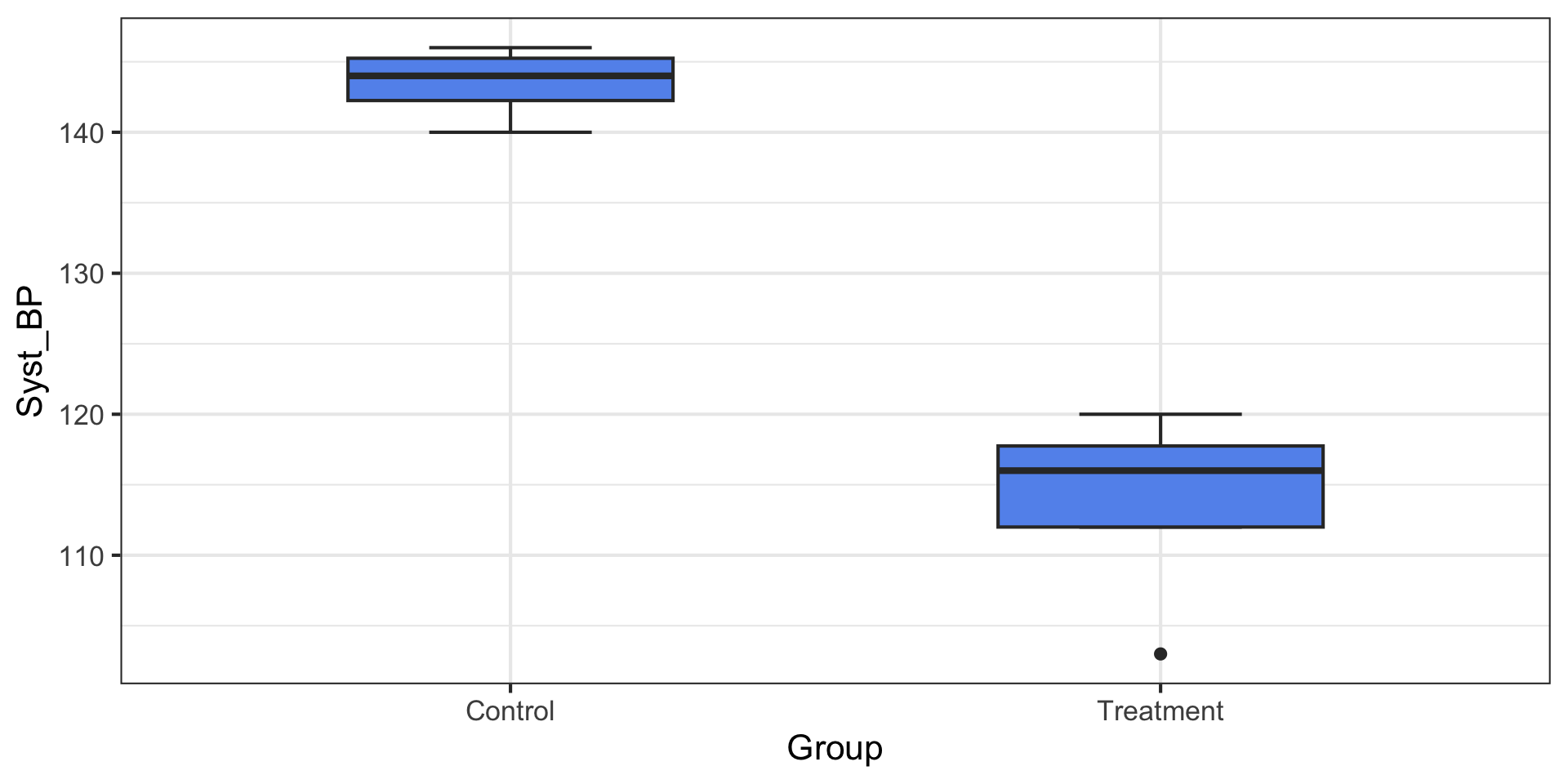
A Numerical and a Categorical Variable
Side-by-Side Boxplot
Two Categorical Variables
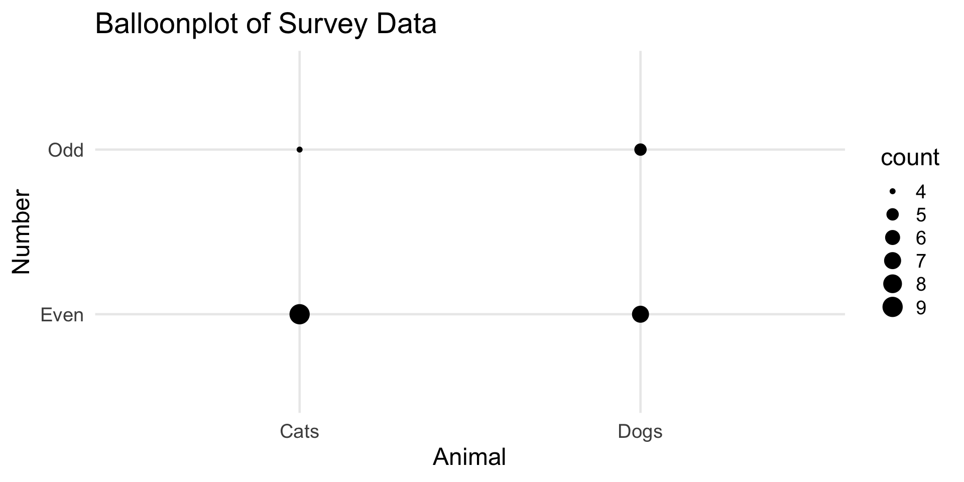
Animals and Numbers
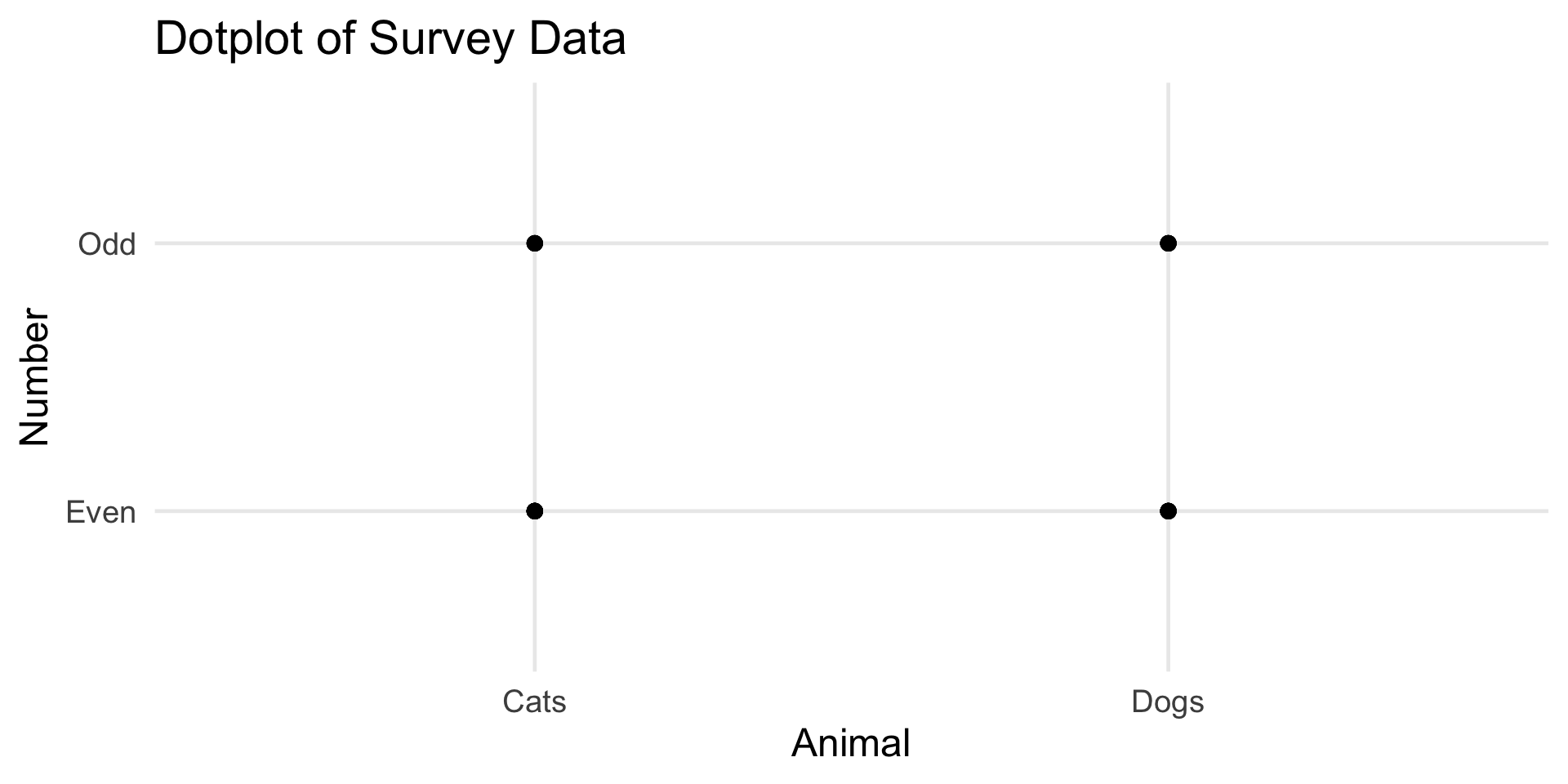
Two Categorical Variables
Animals and Numbers
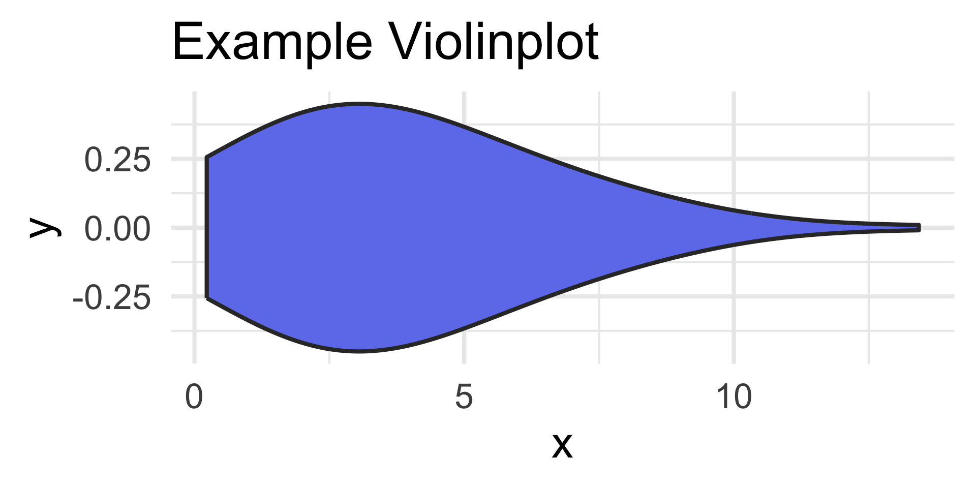
Extensions
- The plots we talked about today are just the basics!
Violinplots
Hexagonal Heatmaps
Extensions
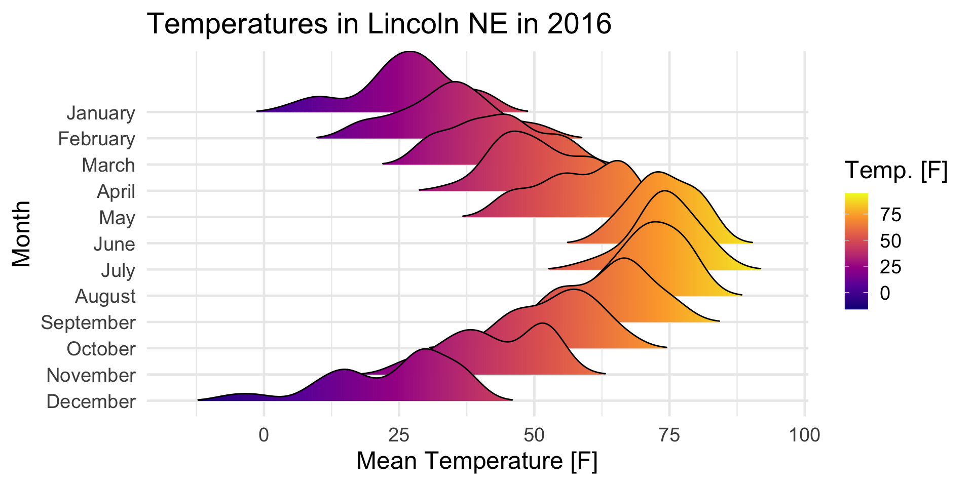
Ridgeline Plot: